🎯
Readable PascalCase naming
Utilities such as DisplayFlex and JustifyContentCenter are easier to scan in HTML than terse abbreviations.
PascalCSS is a modern, lightweight, utility-first CSS library with readable PascalCase naming. You add one stylesheet, write classes that look like real words, and ship.
<link rel="stylesheet"
href="https://cdn.jsdelivr.net/gh/gae4it/pascal-css@4.0.0/pascal-css.css">

<div class="DisplayFlex JustifyContentCenter AlignItemsCenter Padding20 BgBlue500 FcWhite">
  <h1 class="Fs30 Fw700">Hello PascalCSS</h1>
</div>
Why teams pick it
The main advantage is not just file size. It is lower cognitive load: class names are explicit, the setup is immediate, and responsive utilities are already there.
Utilities such as DisplayFlex and JustifyContentCenter are easier to scan in HTML than terse abbreviations.
PascalCSS is pure CSS. You can use it from a CDN or local file without PostCSS, config files, or framework integration.
It uses OKLCH colors, custom media, and responsive typography while keeping the public API simple.
Sm:, Md:, Lg:, Xl:, and Xxl: let you express layout changes directly in the markup with predictable breakpoints.
The release artifact is ready to ship as one CSS file, which keeps adoption and deployment straightforward.
It is a good fit for products targeting current Chrome, Safari, and Firefox versions where modern CSS is acceptable.
Naming conventions
PascalCSS self-descriptive classes let you write correct markup right after reading the documentation.
Content Wrapper
Wrap your content in a dedicated wrapper. The final number indicates the max-width in px.
ContentWrapper640 ContentWrapper768 ContentWrapper960 ContentWrapper1000 ContentWrapper1024 ContentWrapper1140 ContentWrapper1260 ContentWrapper1366 ContentWrapper1450 ContentWrapper1600 ContentWrapper1920Font Size and Weight
From Fs07 (0.7rem) to Fs100 (10rem). For weight, use Fw with a direct value, e.g. Fw500.
Fs07Fs14Fs30Fs100Fw400Fw500Fw700Colors
The palette follows the 50, 100, 300, 500, 700, 900 scale for text, backgrounds, and borders.
FcOrange50FcRed700BgBlue500BcGray300Spacing and lengths
Intuitive scales: 05 = 0.5rem, 10 = 1rem, 35 = 3.5rem. Directions use T, R, B, L. For width, the number represents the percentage (Width30 = 30%).
PaddingB25MarginT15Gap25Width30BorderRadiusTR20Direct mapping to CSS
Utilities explicitly declare the applied CSS property.
DisplayFlexFlexDirectionColumnAlignSelfCenterVisibilityHiddenTextWrapBalanceBackgroundSizeCoverResponsive prefixes
Mobile-first by default. Add prefixes from Sm: to Xxl: to override styles at each breakpoint and up.
DisplayFlex Md:FlexDirectionRowWidth100 Lg:Width50Gap10 Xl:Gap25Sm:DisplayBlockDisplay and visibility
Show, hide, and adapt UI parts across breakpoints without custom CSS.
DisplayNone Md:DisplayBlockHiddenSmVisibleLgOverflowHiddenPositionRelativeResponsive engine
v4.0.0 ships responsive prefixes across the utility surface, so layout changes stay inside the class list instead of jumping into custom CSS files.
Mobile-first default styles
Large phones and small tablets
Tablets and small laptops
Laptops and desktops
Large desktop layouts
Ultra-wide screens
<div class="DisplayFlex FlexDirectionColumn Md:FlexDirectionRow Gap20 Padding20">
  <div class="Width100 Md:Width50 BgGray100 Padding15 BorderRadius10">Card 1</div>
  <div class="Width100 Md:Width50 BgGray100 Padding15 BorderRadius10">Card 2</div>
</div>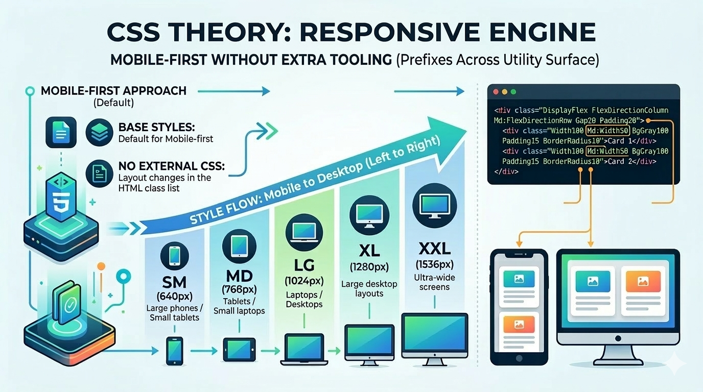
Fit and positioning
PascalCSS trades Tailwind’s terse shorthand and build-centric workflow for explicit naming and single-file delivery.
PascalCSS stays utility-first and CSS-only, which makes it lighter when you do not need a component or JavaScript layer.
Next step
The recommended flow is simple: install the stylesheet, scan the class reference, then test ideas in the playground. Get started in just 5 minutes.